Client
Unidad Minera / GP
What we did
Branding
Year
2026
Client
Unidad Minera / GP
What we did
Branding
Year
2026
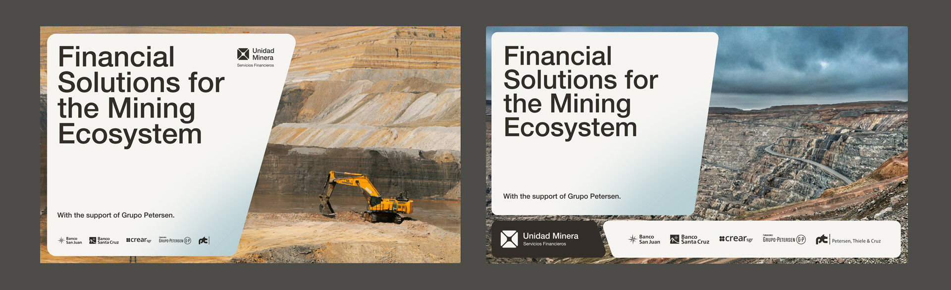
UNIDAD MINERA was founded with the mission of serving as a strategic partner to Argentina’s mining ecosystem.
Its purpose is to promote world-class mining with a local identity, integrating financial solutions that support the sustainable development of regions and their communities.
GP commissioned us to develop the brand’s global identity.
What follows is a summary of the process: the strategy, the conceptual frameworks, the core definitions, and the graphic system we built to shape this identity.
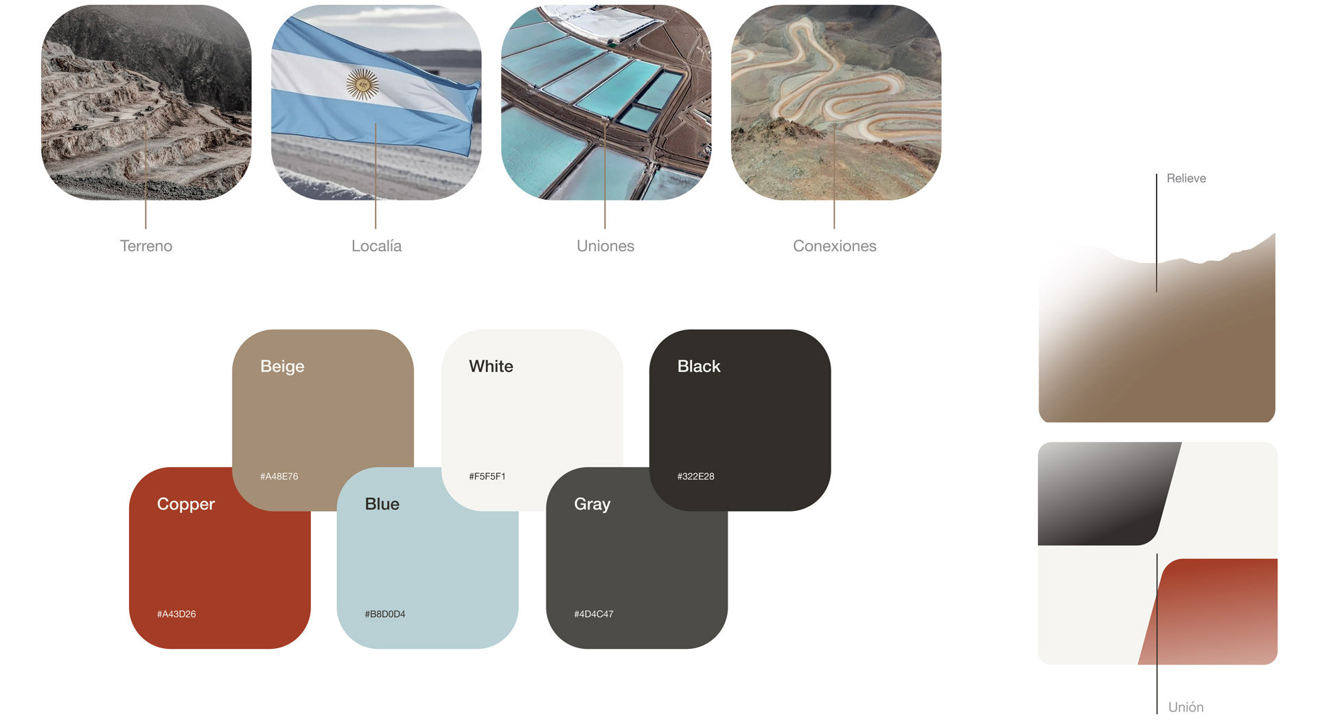
Based on the information received, we analyzed the brand’s current state in search of insights capable of guiding its communication identity.
This work allowed us to identify opportunities and define a positioning within the mining ecosystem and its various levels of engagement: local (communities), provincial, national, and international.
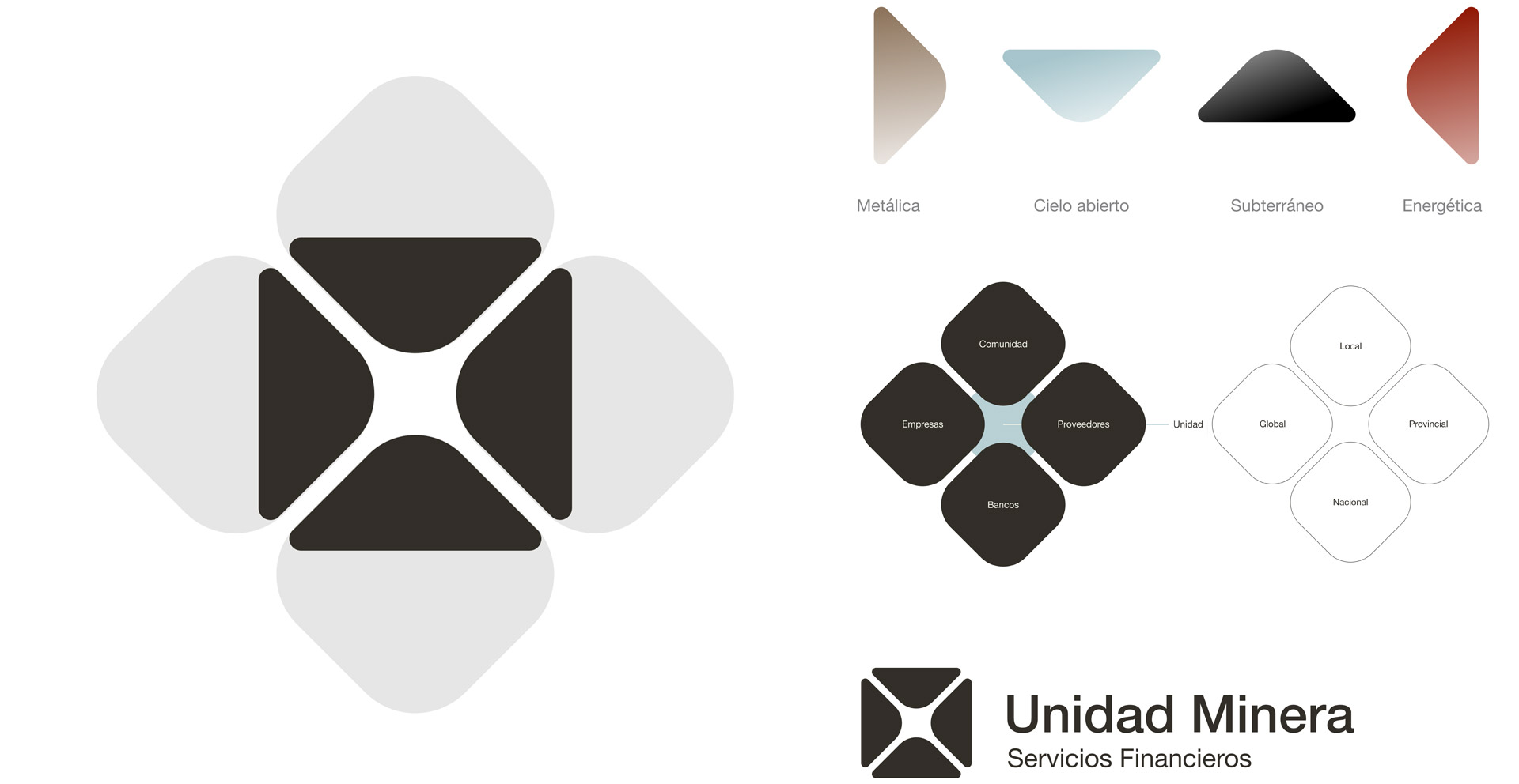
In designing the trademark, and based on the research conducted, it was determined that concepts such as Unity, Connection, and Identity would serve as guiding principles throughout the entire project, and particularly in the creation of the logo.
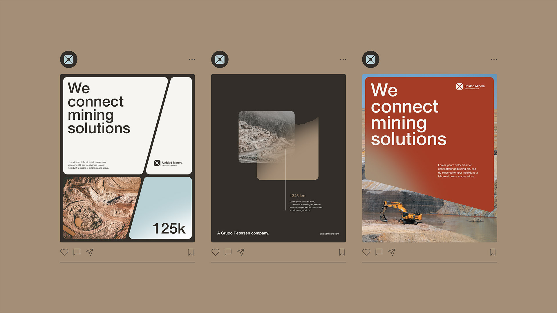
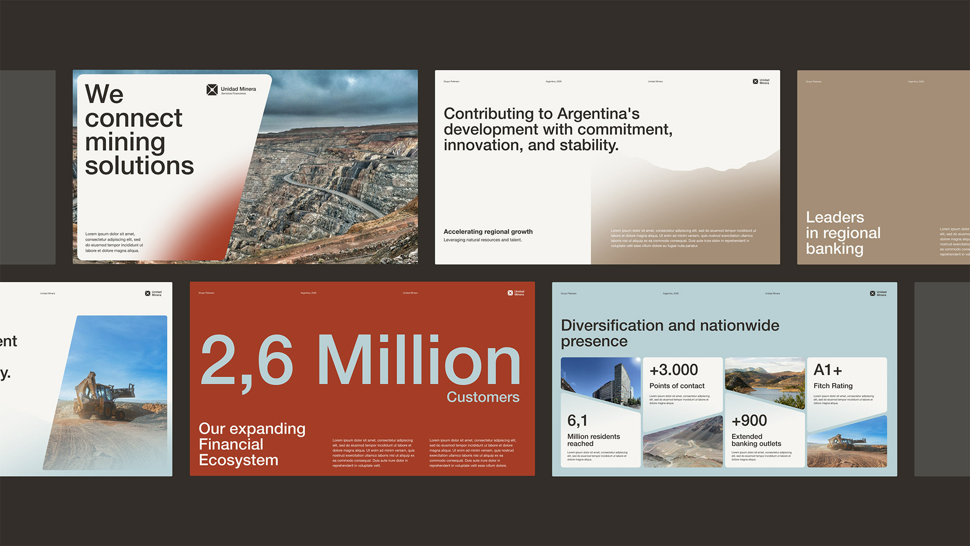
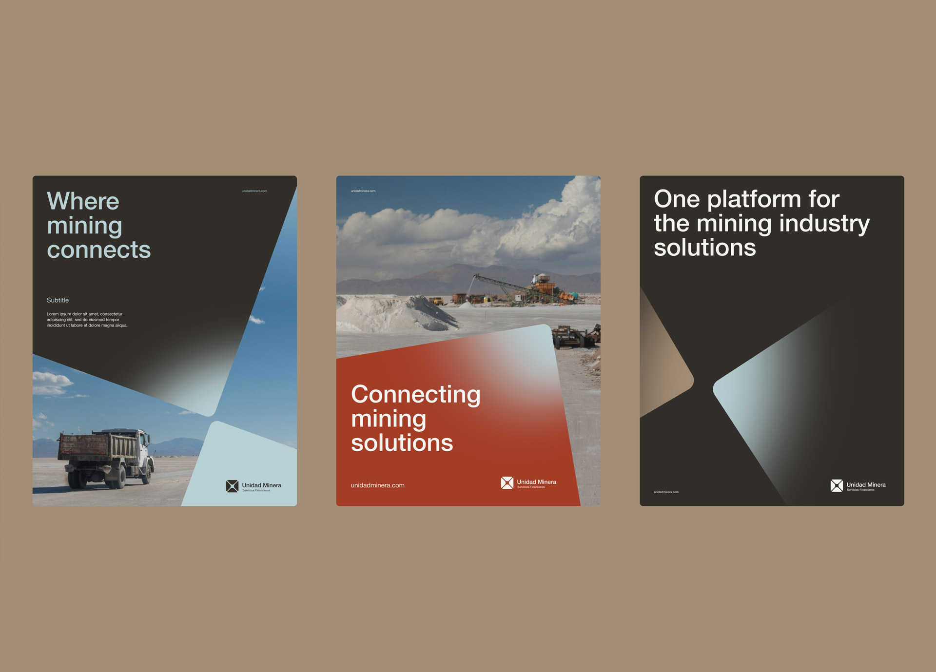
Starting with a robust modular system and using graphic and photographic elements, we began to develop a suite of communication materials designed to meet a wide range of requirements across the various platforms where they will be deployed.
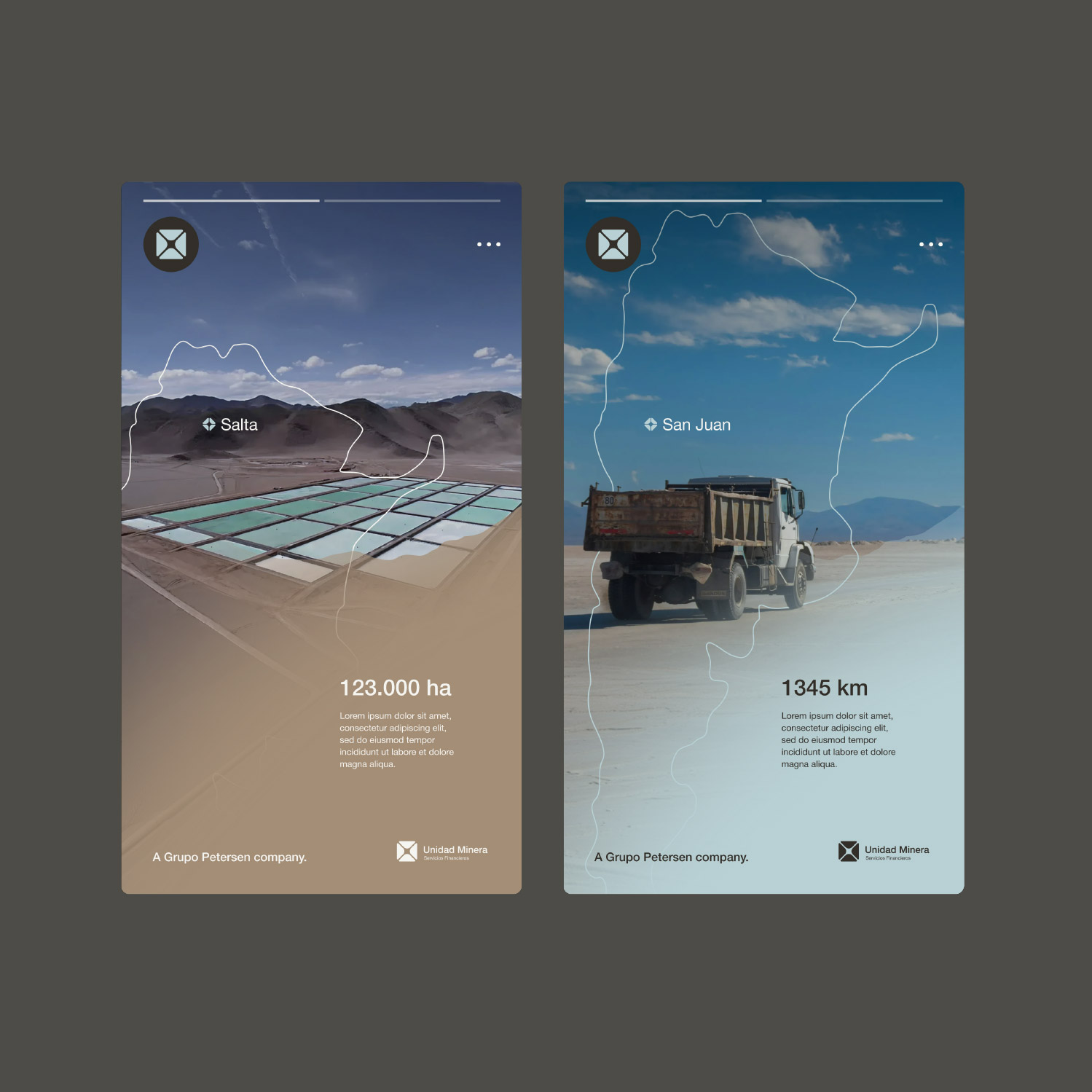
Every medium and every form of communication becomes an opportunity for the graphic system to unleash its potential.
The balance between variables and constants enables multiple combinations, creating fluid, elegant, and dynamic visual communication.
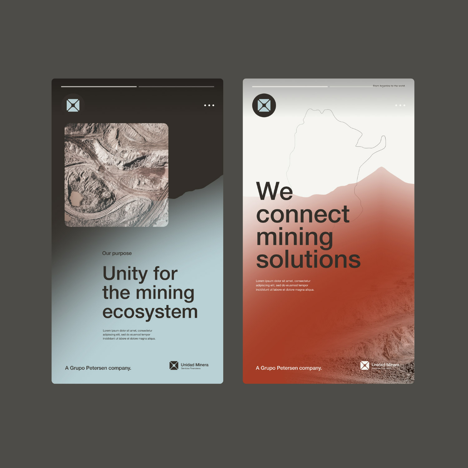
The graphic-discursive framework was designed with resource efficiency in mind: few variables, many possibilities.
We consider something to be complicated when its elements belong to numerous different categories; conversely, it is complex when a large number of elements can be organized into just a few categories.